
The Attendance Model…
I’ve received several inquiries pondering attendance and how it’s changed over time. In my last entry, “Understanding Attendance,” I pointed out two major issues with attendance figures provided by event facilities and NASCAR. The problems and solutions are described below:
- Inflated estimates. Many post-race attendance numbers disconnect with the actual number of fans in the grandstands. I adjust every track’s capacity to its largest-attended race (above the listed capacity) to combat this problem.
- Varying capacities. Because facilities oftentimes change the supply of seats for a race, calculating attendance as a percent of capacity is errant. As such, measuring the outright, reported attendance is more appropriate.
After adjusting values for these issues, I charted the average attendance in the graph below. Sellouts are marked with an “X”:
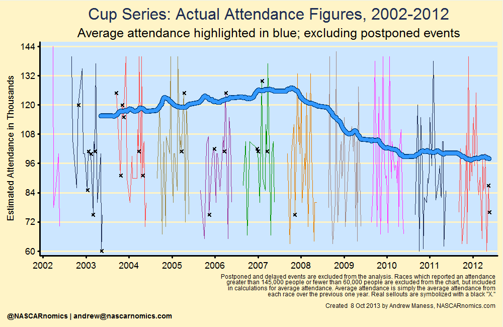
While this was a substantial improvement from simply plotting demand as a percent of the number of seats at a track, there is still work to be done. Sell-outs introduce another statistical problem; they do not capture the entire demand to see a particular race. For example, Bristol sold all of its 160,000 tickets for several years. Despite having demand that outweighed the short-track’s seating supply (through wait-lists), the attendance was always reported as 160,000.
Fortunately, censored regression modeling can alleviate the problem of “unobserved demand.” Regression modeling takes into account several variables which impact attendance and finds those characteristics’ individual relationships with the number of attendees. Specifically, a censored model determines how many fans might have attended a race if a track had infinitely more tickets available. I take into account a variety of event characteristics — including several economic, location, schedule, and race-quality terms — to predict the theoretical demand for sold-out races.
From 2002 through 2012, I tallied thirty-six legitimate sell-outs [after my adjustments from problems (1) and (2) above]. The following table lists a sample of some of those events, their listed attendances (which were at full capacity), and their predicted values (from the censored regression model) given the characteristics surrounding that particular race:
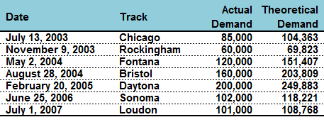
For the sake of saving space, I randomly listed seven of these sold-out events. (As Clint Bowyer would remark, “Don’t read too much into it.”) My censored regression model for attendance (presented in the next table) does a nice job of capturing demand. For example, the 2003 race from Chicago sold all of its 85,000 seats; if more were available, however, the facility could have attracted over 104,000 race-fans. So what happens when I substitute these theoretical attendance values? The following graph compares the actual attendance in blue to my theoretical values in red:
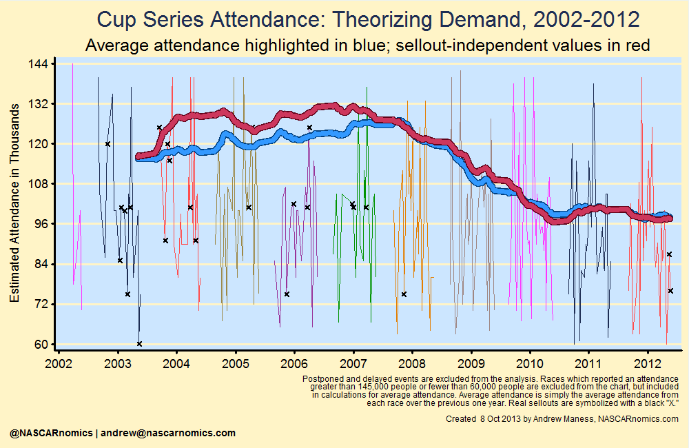
As expected, simply plotting the reported attendance (blue) underestimates what the total demand (red) was in the mid-2000s. There were a number of sell-outs in that particular time-frame; if tracks had larger capacities, those extra seats likely would have been filled (I’m neither endorsing nor opposing a policy for tracks to expand or contract seating). In 2004, the total theoretical demand for the entire season was almost 400,000 people greater than the simple attendance reported by facilities.
So what characteristics drive these theoretical values? Does location matter? What about scheduling? And what about that pesky economy? The following table lists my censored regression model. In particular, each line measures the impact on attendance from a given race characteristic:
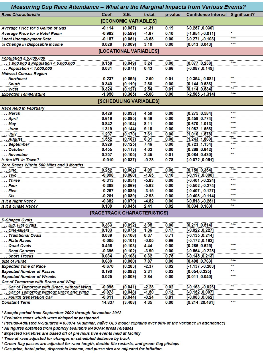
So there’s a lot going on there. Don’t worry; I’ll dig more into this throughout the fall and winter. If you’re not experienced with regression modeling, you’ll want to narrow your focus to the first two columns. The first column lists the variables that affect attendance. The number directly next to each race quality tells you how that characteristic affects the number fans in the stands.
For example, the coefficient next to “Is It a Chase Race?” is 0.109. This means that an event held in NASCAR’s playoff historically draws an in-person audience that is 10.9% larger than a similar race held during Cup’s regular season [0.109*100]. Similarly, a 10% increase in the rate for a hotel room (listed in the second line) results in a decrease in attendance by almost 10% [-0.982*10]. Meanwhile, categories that compare themselves to other lines are calculated similarly. One may opine, then, that events held in the South attract an audience that is 34.0% larger than a similar event held in the Midwest [0.340*100]. Very generally, know that a positive coefficient in the second column means that more of that characteristic leads to more fans in the stands; while a negative value represents a decrease in an event’s attendance when that variable increases.
These interpretations of race qualities’ impact on attendance will be the basis for a lot of my research this fall. If you don’t fully understand that table — it’s okay; I’ll assess each characteristic individually in the coming weeks. I’m very thrilled that this core set of characteristics explains almost 90% of movements in attendance from the previous decade. (In my opinion, the other 10% stems mostly from ticket prices, marketing, Dale, Jr., and randomness; never ignore randomness — statistics cannot explain everything.)
While I’ll investigate in the future how track configurations and scheduling might affect the grandstands, I provide a brief glimpse of a cool results from censored regression modeling. Since I can isolate the impact of several variables; I may determine just how much the economy influenced attendance over the previous decade. The next graph plots the theoretical demand (the same red line as the previous graph), while the green line imagines the average attendance from race-to-race as if the economy were consistent:
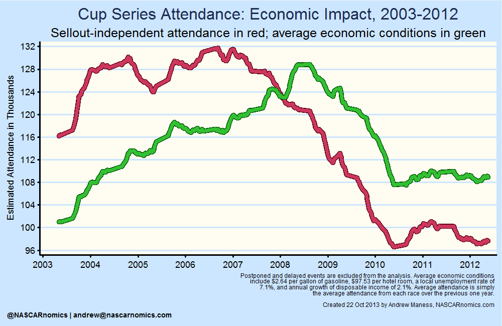
I think that’s pretty cool. The economy certainly influences attendance heavily (as evidenced by the dramatic change in attendance in the red and green lines). The green line represents a hypothetical scenario in which unemployment, hotel prices, gas prices, and disposable income were constant throughout the decade. This “economy-adjusted” attendance average gives a clearer picture of how attendance to NASCAR races has changed for reasons not related to the economy. As the reader can see, the product has endured its ups-and-downs, but the economy-adjusted attendance is almost equal to number at the start of 2004.
I’ll further analyze that topic in the future, but I wanted to show you how statistics can be another tool for assessing the popularity of NASCAR — both on television and at the turn-style. This research opens a lot of doors for how we can understand and visualize changes in attendance and its driving factors over time. If you have questions, please reach-out to me on Twitter at or send me deeper thoughts via electonic mail at . Thanks for reading — I’m glad that you took the time to check through some of this analysis.