
Understanding Attendance…
[NOTE: I've received many inquiries about attendance figures and how they've changed in NASCAR over time. Some of my focus this fall will be on the factors that influence potential attendees' trips to types of NASCAR races. I'll quantify the effect of Cup drivers' participation in the Grand National Series. I'll determine if companion weekends for national series help or hinder each other. I can examine how television ratings and attendance relate.Television ratings are a better measuring stick for interest in NASCAR because of wider availability, relatively fixed costs, and impermeability from the economy; but that doesn't mean that we can't examine the several factors that impact fans at tracks. This should be a fun set of topics. Buckle-up.]
My motivation to study NASCAR’s attendance history is to analyze a population’s desire to view a race in-person. Furthermore, I can quantify how much the economy, on-track product, and a several other factors impact the demand to see races. But before I analyze, I need to determine the proper way to measure attendance. I identify three hurdles that must be overcome before performing in-depth analysis:
- Inflated estimates. Several anecdotes recall events that are classified as sell-outs despite thousands of seats appearing empty. The disparity between turn-style attendance and tickets sold may explain part of the discrepancy; but reasonable adjustments to the data must be made.
- Facilities’ varying capacities. Some race-tracks might adjust their supply of seats — as a result, the percent of crowd-capacity filled might improve despite lesser or unchanged demand. I create a solution for this issue.
- Sell-outs. Legitimate sell-outs throw a wrench into measuring demand. In those cases, demand exceeds the supply and one cannot view unobserved “demand” via waiting lists for tickets, etc. Fortunately, there are statistical instruments to alleviate this problem.
I begin with a very innocent visualization of attendance. I use attendance figures released by NASCAR and plot the percent of the track’s capacity that each race garnered. To calculate, I simply divide the estimated attendance by the publicly-listed capacity from each race-track. The following graph displays all on-time races, color-coded by year. The thick red line demonstrates the median percent-capacity over the previous one year. Each “X” represents a reported sell-out:
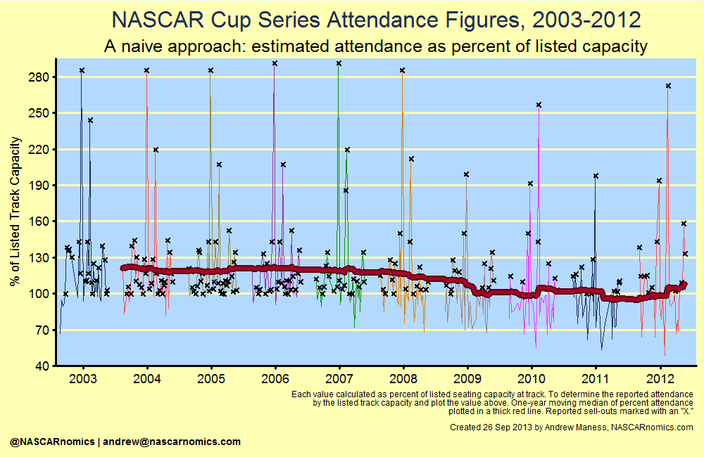
Graphically, there are many events which were classified as “sell-outs” since the estimated attendance met or exceeded venues’ listed capacity. According to the above chart, the average percent of capacity never dipped below ninety-percent; which diverges from anecdotes that identify mostly under-attended races since 2007. Additionally, some estimated values report races that eclipsed the listed capacity by two and three times. For example, the 2007 event at the Kansas Speedway held an estimated 137,000 fans. Its listed capacity for that year was 82,000.
Before any substantial research on attendance can be accomplished, I devise a method to dull these outlying data. First, I determine the number of seats by which the estimated attendance eclipsed the listed capacity for each track. I calculate this in the “# of Seats over Capacity” column in the table below:
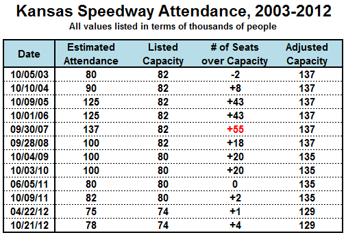 After finding those numbers, I identify the largest value in that column (highlighted in red) and add that to the “listed capacity” to produce the “adjusted capacity” in the final column. The motivation of this algorithm is to find a closer-to-reality measurement of a facility’s actual capacity. Since the Kansas Speedway held 55,000 more people than its publicly-listed number of seats, I assume that the venue can hold at least 55,000 “extra” fans at any point.
I apply this concept to every venue in NASCAR and plot the percent of ”adjusted capacity” in the next graph. Under this scenario, a sell-out is equal to 100% of the facility’s adjusted capacity. I plot the sell-outs defined by my algorithm with an “X”:
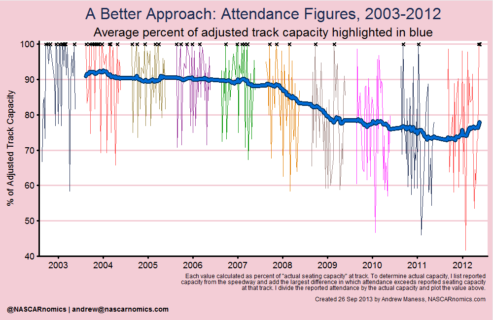
This is more realistic. On average, most facilities maintained a steady stream of fans to their annual or bi-annual events until the financial crisis. Once the economy declined, attendance at most race-tracks consistently dropped. This measurement of attendance also indicates, however, that NASCAR recovered almost of its attendees lost during the previous three years in 2012.
While this approach is intriguing, there is another flaw to measuring demand in this manner. The above chart measures the desire to attend a race relative to its supply. That is, we aren’t getting a true sense of demand because the capacity at race-tracks can change over time and across facilities. The following chart shows how tracks have collectively changed their average adjusted capacity in recent years:
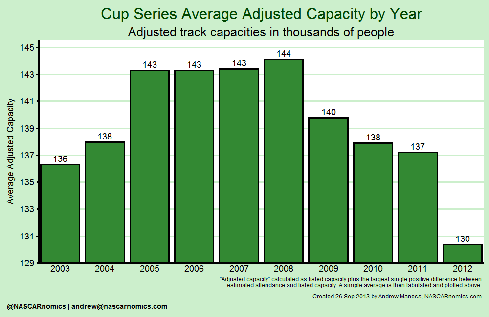
Specifically, the perceived increase in attendance in 2012 is bolstered by several tracks’ reducing the number of grandstands to approach a scenario in which their supply equals the demand of attendees. All other factors held equal, a track that lessens its number of grandstands artificially increases its demand under the measurement proposed above. (Additionally, increasing attendance relative to the number of seats available translates to a different number of actual attendees varying by facility, i.e. 80% adjusted capacity at Texas Motor Speedway is almost 150,000 fans greater than 90% of the adjusted capacity at Darlington Raceway.)
To alleviate supply’s interference with the demand measurement, I apply an elegant method — I plot the estimated attendance for each race. I mark my algorithm’s sell-out events with an “X.” To save space, I do not chart any race that included more than 160,000 fans. Those values, however, are taken into account in the one-year moving-average denoted by the thick yellow line:
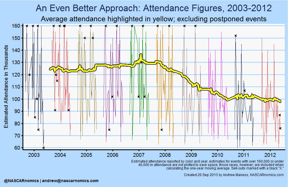
This chart is a major improvement from our earlier supply-induced demand graphs. The graph provides a very straightforward narrative — NASCAR’s top series garnered slowly increased its race-weekend attendees through 2007. Collectively, the series lost much of its demand during the financial crisis. Finally, attendance remains flat since the recession.
But there is still one more flaw with this method — measuring sell-out events. Even though I adjusted for inflated sell-out observations, I still need to estimate demand for those races which sold-out under my adjusted capacity definition. The above chart essentially underestimates the demand for sell-out races. I provide an example for why this must be fixed:
Bristol Motor Speedway’s numerous sell-outs through the mid-2000s equaled its capacity of 160,000 people. There were many fans, however, on waiting lists and other mechanisms. In essence, the “true” demand for a ticket to the Tennessee short track was greater than 160,000 (that is, it was the number of people at the race plus those on waiting lists and others prepared to pay for a ticket if it were available).
Fortunately, there exists a statistical method called censored regression modeling that allows one to identify what attendance to these races could have been — if the supply for viewing in-person were unrestrained — given a set of variables; such as, economic factors, race characteristics, location features, etc. This is a great feature since it will not only solve our “binding ceiling” quandary, but it will also determine what forces led to changes in estimated attendance.
That’s my really forced and awkward lead-in to my next attendance entry! I’ll dive-in to what drives attendance. How does the economy influence race-watchers? Gas prices? Local unemployment rates? Do the points standings matter much? What about the location of the track? And do night races play a significant role in attendance? The next entry will cover these aspects and unveil a model that can explain almost ninety-percent of movement in attendance.